Flowchart Update
Good Day Folks,
Hope that things are going well for you, as of writing this I've just about finished adding in a few pieces of polish for the game. Mainly some faster transitions for sprites and scenes as well as a screen shake that isn't the Ren'Py default just because I figured it would be nice to add in. But the big thing that I've changed (and am still toying around with) is the flowchart.
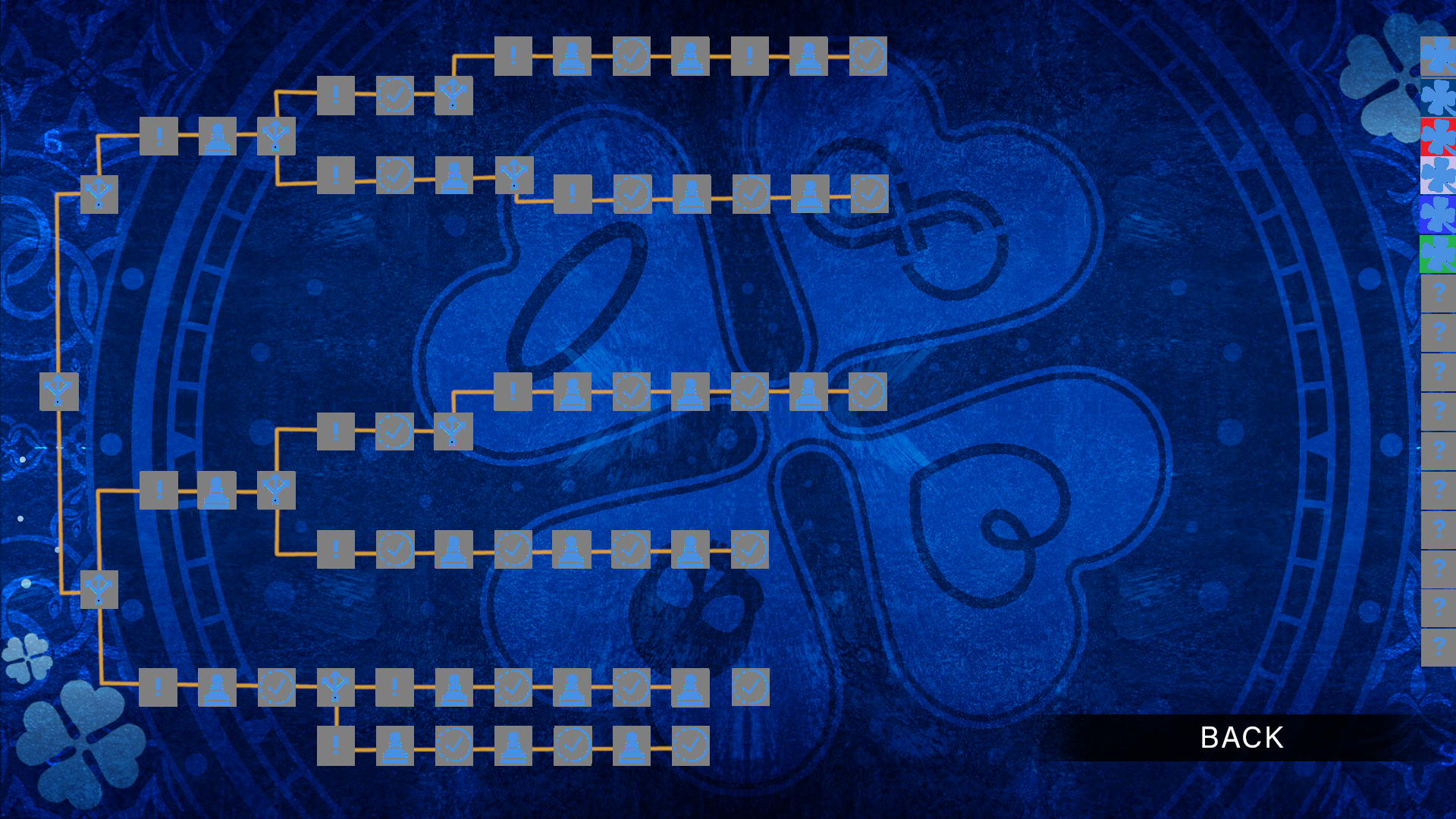
Let's first take a look at the old version of the flowchart.

It's passable, it works for the function that it serves. But it's definitely hard to read, the colors don't quite pop off the background for some of the icons and there's some blur with the edges of the boxes and the icons themselves. And the clover icons on the far right for the character endings were... well they could be better for sure. Granted, this was just something I put together in a few hours so it wasn't meant to be amazing but it's obvious that it can use some improvement.
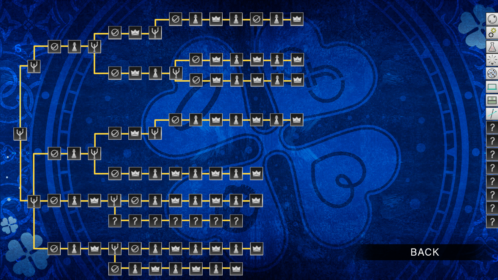
Here's a look at the new version!

As you can see all of the old icons have been replaced with something a bit sleeker and easier on the eyes in my opinion. You can all thank Khoaisama, for the new icons. They're quite more colorful and also make it more obvious what each icon represents. Though there are really only a small set of icons in the flowchart and what they represent.
Choice: Pretty obvious, some kind of means to branch off into a new route. Though the choices themselves
Selection: This just highlights that you've made a specific choice after a branch signaling the start of a new route or something similar in nature.
Game: Usually the start of a game section, either right before the game start or the game explanation so that you can jump right into it. This can come in handy if you want to replay certain choices in games.
Win: The victory or conclusion of a game, this is usually less about winning and the scene that occurs after the victory itself.
Character Ending: A small icon that signifies that a character ending has been reached. As you can see there are 16 blocks on the right, each for the 16 members of the main cast.
For a game with as many choices and branching paths, it's vitally important to have a flowchart and especially to have a flowchart that's easy to read and understand. I'm still going to be playing around with some of the design of the flowchart as I continue with development, possibly making certain icons bigger or changing their positions just so that they look better. But anyway, that's just a small thing that I wanted to highlight for today.
Hopefully in the next month or so there'll be something really nice to show you! So I do ask you to be a bit patient for something cool in the future. And as usual, I'll keep you updated as the game gets completed!
Until then,
Good luck and good fortune!
Get The Game of Fourtune
The Game of Fourtune
Survive a mystical death game in sets of four. Four players, four rounds, four deaths, all for one wish.
| Status | Released |
| Author | ZetaKen |
| Genre | Visual Novel, Adventure, Puzzle |
| Tags | Dark, Horror, Meaningful Choices, Multiple Endings, Mystery, Psychological Horror, Ren'Py, Story Rich |
More posts
- A Fourtunate Anniversary Sale!Apr 04, 2024
- The Game of Fourtune Patch 1.3.0.0May 04, 2023
- The Game of Fourtune PostmortemApr 30, 2023
- The Game of Fourtune Patch 1.2.1.1Apr 20, 2023
- The Game of Fourtune is Out!Apr 04, 2023
- Release Date AnnouncementMar 13, 2023
- Current Status of The Game of FourtuneNov 26, 2022
- Making The Game of Fourtune Music: An Interview with Jeff PennyOct 24, 2022
- The Game of Fourtune Trailer!Oct 09, 2022
- Profiles Hotfix UpdateSep 22, 2022

Leave a comment
Log in with itch.io to leave a comment.