Upcoming UI Update + Character Inspirations & Notes 3: Laura Ophio
G'day Everyone
It's been a while since my last update or really any update. But progress on the game is going smooth as usual, I'm about finished with the first draft of scripting through the next route and I only need a few more backgrounds before it's complete. Until then I'll probably do some testing runs through the new part of the game to make sure that there everything will be ready once I've got what I need.
As for today's Devlog, I figured I'd talk about a number of things, a small update to the UI and just talking about another character. But first just a small change to the UI.
I got a bit of feedback on the text, the text box, buttons, and other things. So I figured I'd play around a bit with the UI to see if maybe I could make it better.
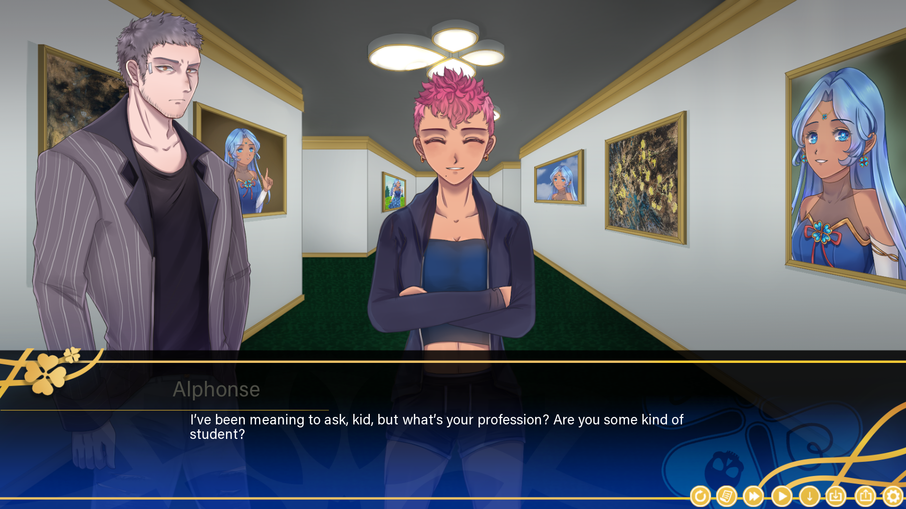
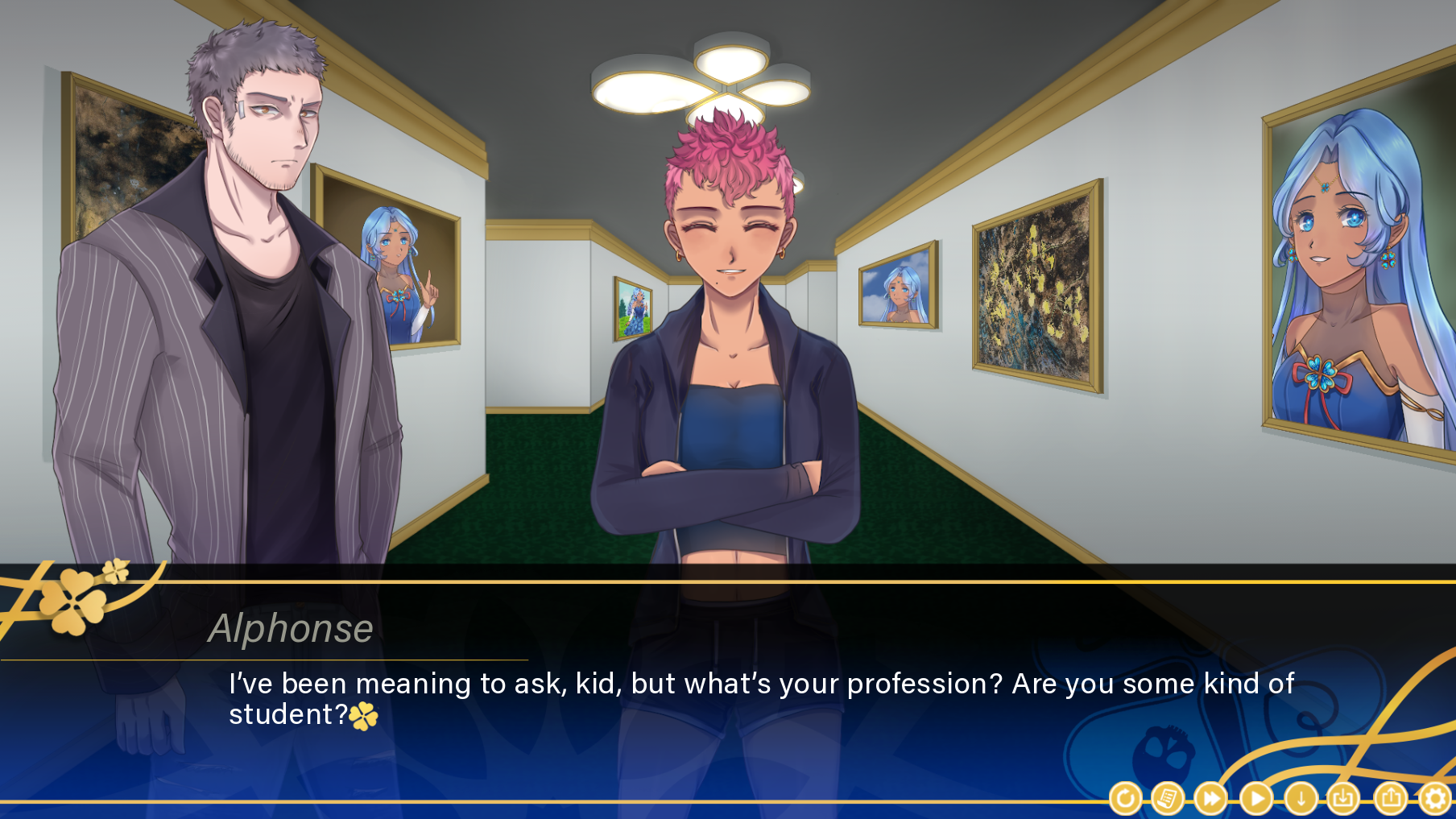
To start, I increased the text size because it really was too small. I feel kind of silly that I was okay with the small text size for so long but in hindsight, it really was hard to read at times without focusing. Next, I altered the character tag to be an italicized font rather than a bold one. It just fits better with the elegant theme of the UI. I adjusted some of the character tag colors too so they look better on the dark part of the textbox. Finally, I adjusted the textbox so that there was a bit more padding on the top and also stretched out the textbox so that it would make use of the extra spacing on the side to accommodate the bigger text. All in all, I think that it looks much better than it did before!
I played around with some styles. At first, I wanted to try putting the character name on the bottom left and angle it diagonally... but I just couldn't make it fit right. Plus it was difficult to manage the size of the character names when they were first introduced. Such as Laura being called (Green-Hat Lady) and it wouldn't fit. So I scrapped that idea pretty quickly and moved on to two other ideas.
The first was to move the character tag down to the center and middle, it draws attention to the text box and gives a bit more room for the text at the top.

The downside is that it looked a little awkward, and it was also a bit unusual for most readers whose eyes usually go from top left to bottom right since that's how most Americans read. So, while it was nice I figured to simply put the character tag back at the top left.
----
With that out of the way, let's talk about darling Laura Ophio!
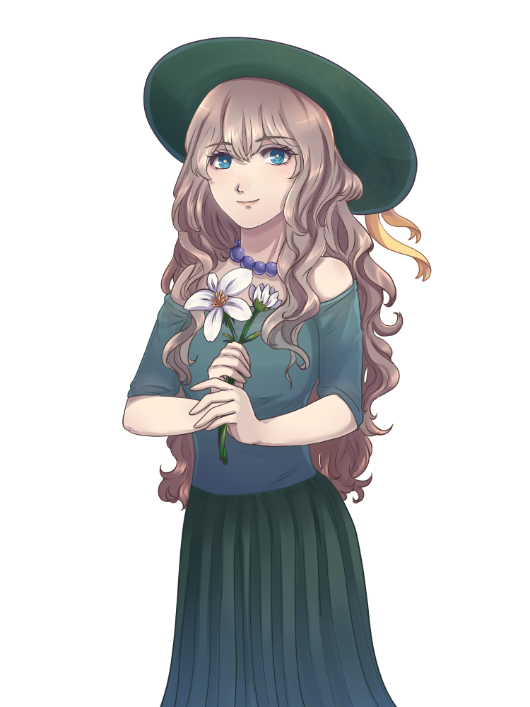
When you look at Laura what do you see? Peace? Kindness? Serenity? Someone that you can trust?
I hope so because those are the kinds of things I want people to think upon first seeing.
Laura occupies a special niche in the game, and one that I think is pretty common. She's the sweet, kind lady that unfortunately finds herself overwhelmed and unprepared for everything happening in the death game. I'd like to say that most people will come to like Laura and will want to protect her. She's helpful, nice, generally wants to do as much as she can to keep everyone alive but also seems to be a little on the meek side.

Don't mistake that kindness for weakness. There are a few things that can set Laura off and despite her meek attitude, she has what I'd consider one of the strongest wills out of all the characters in the game. Willing to take risks and struggle where others would quickly give up.

As for Laura's inspiration... she was initially just a background character for Lilith Ophio (Who we'll talk about later). A character that acted as a foil to her somewhat abrasive, pragmatic, and self-serving sister. She still serves that purpose in the game today, wherever Lilith goes Laura is sure to follow. So even if you have to deal with Lilith's abrasive attitude Laura will be there to smooth things over (until she's not). When I think Laura, I think Luna from Zero Escape: Virtues Last Reward. Someone that people deign to harm or betray but nevertheless might have to make that painful decision eventually. But Laura plays a bit of a bigger role in the story than just being one of the kind characters in the cast. But her plot and how it ties to others will be revealed over time as more and more routes are released.
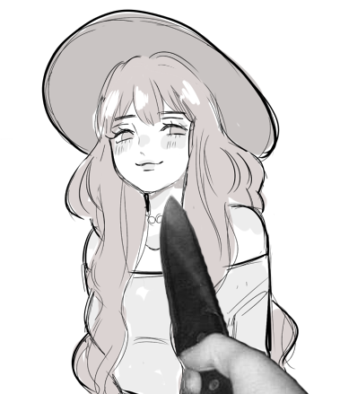
Hopefully, all of you who have played The Game of Fourtune thus far have enjoyed Laura so far and I hope that she endears her way into your heart.
Until next time, Good Luck and Good Fortune
-ZetaKen
Get The Game of Fourtune
The Game of Fourtune
Survive a mystical death game in sets of four. Four players, four rounds, four deaths, all for one wish.
| Status | Released |
| Author | ZetaKen |
| Genre | Visual Novel, Adventure, Puzzle |
| Tags | Dark, Horror, Meaningful Choices, Multiple Endings, Mystery, Psychological Horror, Ren'Py, Story Rich |
More posts
- A Fourtunate Anniversary Sale!Apr 04, 2024
- The Game of Fourtune Patch 1.3.0.0May 04, 2023
- The Game of Fourtune PostmortemApr 30, 2023
- The Game of Fourtune Patch 1.2.1.1Apr 20, 2023
- The Game of Fourtune is Out!Apr 04, 2023
- Release Date AnnouncementMar 13, 2023
- Current Status of The Game of FourtuneNov 26, 2022
- Making The Game of Fourtune Music: An Interview with Jeff PennyOct 24, 2022
- The Game of Fourtune Trailer!Oct 09, 2022
- Profiles Hotfix UpdateSep 22, 2022
Leave a comment
Log in with itch.io to leave a comment.